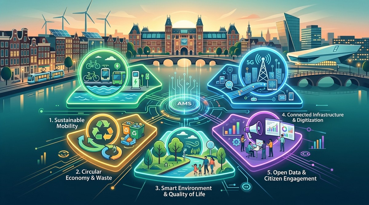
Amsterdam’s smart city programme is often held up as a global example. But how do its planners know if the investments are working? The answer lies in a set of carefully chosen performance indicators. These metrics go beyond tech adoption. They measure real changes in how people move, breathe, and connect. For any urban planner or researcher looking to build a data-driven city, understanding these five KPIs offers a practical starting point.
Amsterdam measures smart city success through five core KPIs: modal split, air quality, circular material use, digital inclusion, and citizen satisfaction. Each KPI is tracked with open data and updated annually. These indicators help the city shift from tech hype to measurable impact. Urban planners elsewhere can adopt the same framework to align projects with real-world outcomes.
Why Amsterdam’s choice of KPIs matters
The smart city sector is full of grand promises. Vendors sell sensors, dashboards, and platforms. Yet many cities struggle to prove that these tools improve daily life. Amsterdam sidesteps that trap by anchoring every project to a small set of outcome-based KPIs. The logic is simple: if you cannot measure the benefit, do not deploy the technology.
The city’s approach is also collaborative. The KPIs were developed through public private partnerships and refined with input from researchers. That means they reflect both policy goals and the lived experience of Amsterdammers. As one city data officer put it:
“Our KPIs are not just numbers on a dashboard. They are the core of our conversation with citizens. When air quality improves, people feel it in their lungs. When bike lanes get safer, ridership grows. We measure what matters to the people who live here.”
This focus on tangible outcomes makes Amsterdam’s KPI framework a valuable model for other cities. Let’s look at each indicator in detail.
The five KPIs Amsterdam tracks
Each KPI is tied to a specific policy target and updated at least once a year. They cover mobility, environment, resource use, digital equity, and governance.
- Modal split by sustainable transport – Percentage of journeys made by bike, on foot, or by public transport. Target for 2026: 70% of all trips inside the ring road are carbon free.
- Air quality index (NO2 and PM2.5) – Average annual concentrations measured at 35 street level sensors. The goal is to stay below WHO guideline levels by 2030.
- Circular material use rate – Share of materials that are reused, recycled, or composted. Amsterdam aims for 50% circularity by 2030 in construction and household waste.
- Digital inclusion index – Composite score measuring broadband access, digital literacy course completion, and public WiFi usage. The city tracks this by neighbourhood to close the digital divide.
- Citizen satisfaction with city services – Annual survey score (out of 10) covering transport, public space, and online services. The benchmark is 8.0 or higher.
These five indicators are deliberately limited. They force the city to prioritise. If a new smart grid project does not improve the circular material rate or citizen satisfaction, it gets rethought.
How the KPIs are put into action
Amsterdam does not just publish these numbers once a year. The city uses them to steer policy in real time. Here is a practical process that planners follow:
- Data collection – Sensors, surveys, and administrative records feed into a central data lake.
- Weekly review – A cross departmental team reviews the air quality and modal split data every Monday.
- Threshold alerts – If NO2 levels rise above a set limit, the city activates temporary traffic restrictions.
- Quarterly adjustment – Budgets for mobility projects are reallocated based on modal shift trends.
- Annual public report – The full KPI dashboard is published on the city’s open data portal. Citizens can comment.
This cycle turns abstract numbers into operational decisions. For example, when the bike usage KPI stalled in 2024, the city added 12 km of protected bike lanes and launched a cargo bike subsidy. Within 12 months the modal split target was back on track.
A closer look at the data behind each KPI
Different KPIs require different data strategies. The table below summarises the main measurement method, frequency, and common challenge for each indicator.
| KPI | Measurement method | Update frequency | Common challenge |
|---|---|---|---|
| Modal split | Inductive loops, GPS data from bike share and public transport, household travel survey | Quarterly for loops; annual for survey | Survey response bias in low income areas |
| Air quality | Reference grade sensors at 35 fixed stations; mobile sensors on trams | Hourly average; published daily | Calibration drift in high humidity |
| Circular material rate | Mass flow analysis of construction and municipal waste | Annual | Shadow economy waste not tracked |
| Digital inclusion | Internet speed tests, library course enrolment, WiFi session counts | Quarterly | Privacy concerns around location data |
| Citizen satisfaction | Statistically valid telephone and online survey (n=5,000) | Annual | Low response rate among 18–24 year olds (now addressed with a text message option) |
The city tackles each challenge by combining multiple data sources. For modal split, it cross checks survey results with bike counter data. For digital inclusion, it partners with social housing associations to distribute smart devices. This layered approach increases confidence in the KPIs.
Lessons for urban planners and researchers
If you are building a smart city KPI framework for your own municipality, Amsterdam’s experience offers several practical lessons.
- Start with outcomes, not technology. A smart bin that does not reduce landfill waste is just an expensive bin.
- Limit the number of KPIs. Five to seven is enough. More than ten creates noise.
- Use a mix of objective and subjective metrics. Air quality sensors tell one story; citizen satisfaction tells another.
- Make the data open. Amsterdam publishes all KPI data under an open licence. That lets researchers verify the numbers and suggest improvements.
- Iterate annually. The KPI set is reviewed each year. If a metric no longer drives action, replace it.
For those interested in the broader ecosystem behind these indicators, the role of data and AI in transforming urban policy in Amsterdam provides a deeper look at how analytics supports decision making. Meanwhile, how Amsterdam uses smart technologies to create a more sustainable city gives examples of specific projects that feed into the KPIs.
What UK cities can learn from Amsterdam’s model
The UK has its own smart city ambitions, from Manchester to Bristol. Yet many councils still struggle with fragmented data and short term funding. Amsterdam shows that a coherent KPI framework can align different departments around shared goals. It also helps justify spending to elected officials. When you can say “every pound spent on cycle infrastructure increased the modal split by 0.4% last year”, the budget conversation changes.
What can UK cities learn from Amsterdam’s smart city success? covers this comparison in detail. One key takeaway is that Amsterdam’s KPIs are embedded in its spatial planning process. The same indicators used to measure progress are also used to evaluate new housing developments and transport schemes.
How to apply this framework to your own work
You do not need a multimillion euro sensor network to start. Begin by choosing three KPIs that match your city’s biggest challenges. For example, if air quality is a political priority, install a few low cost sensors and pair them with hospital admissions data. Track the trend over six months. Then present the results to your planning committee.
A practical checklist for getting started:
- Identify the top three policy priorities in your city’s development plan.
- For each priority, pick one outcome that is measurable and achievable.
- Find at least two data sources to triangulate the metric.
- Set a baseline and a realistic target for 12 months from now.
- Publish the first dashboard on a simple webpage.
Amsterdam’s journey shows that KPIs are not about perfection. They are about direction. The city has revised its digital inclusion index three times since 2022 because the initial version missed vulnerable groups. That is not a failure. It is the sign of a learning system.
As you build your own set of indicators, remember that the goal is not to impress with fancy dashboards. The goal is to create a feedback loop that makes your city more livable. Innovative urban solutions shaping Amsterdam’s future in 2026 shows how the KPI framework continues to evolve with new technologies. And the impact of urban innovation on Amsterdam’s public spaces and quality of life demonstrates the human side of the numbers.
From KPIs to real change
Amsterdam’s five smart city KPIs are not just a report card. They are a governance tool that keeps the city honest. When the modal split stopped growing, the city shifted funding from car infrastructure to bike lanes. When the digital inclusion index showed a gap in the Nieuw West district, the city launched a free tablet programme. The numbers drove action.
For urban planners and researchers, the lesson is clear: choose your metrics carefully, share them openly, and let them guide your decisions. You do not need to copy Amsterdam exactly. But you can adopt the same mindset. Start with what matters to your residents. Measure it consistently. Then use the data to make your city better, one KPI at a time.
About the Author